8
Data Series Coloring Mini Tutorial
 NeoTicker 4 introduces a very flexible scheme to color data series in the chart. In fact, you can even color data series using formulas. The flexibility means there are many options to choose from, which can be daunting.
This mini tutorial is written to help you get started with data series coloring. The example here is using candlesticks, and is equally applicable if you use bars.
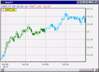
First, create a chart with a data series using candlesticks. It will look something like:
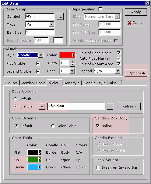
Now double click on the data series legend to open the editor. Inside the editor, do the following:
- Press the Options button if needed to expand the dialog
- Change the Formula to By Hour
- Enable Hollow
- Adjust the Up/Down color
There is no need to press the Apply button. The chart color changes as you adjust the settings.
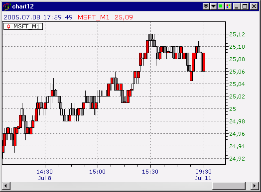
The chart will look like:

Let me explain what these settings do.
First, the By Hour formula tells the chart that it should color the bars using two colors, alternating by the hour. In the figure, you can see the candlesticks change color at 14:00, 15:00 and so on.
The Hollow stick settings is the tricky part. A full candlestick is too complex for coloring to work coherently (it has 3 independent colors). So NeoTicker requires you to turn on Hollow setting, which forces each candlestick to use a single color.
Finally, the up/down color determines the coloring.
The NeoTicker manual provides a complete reference to candlestick coloring, under the section Operation Guide>Time Chart Operation Guide>Data Series and Indicators>Color Data Series.
In a future tutorial, I will talk about how to write your own coloring rules using formulas, bringing out the true power of data series coloring in NeoTicker.
Louis
Share: digg | del.icio.us | Technorati | StumbleUpon